My thoughts on Arc, from the perspective of a developer
A review of Arc from the perspective of a developer. I share my thoughts on the browser, the good parts, the bad parts, and some nice-to-haves.

In the last few weeks, I kept hearing about this new browser called Arc. I was curious, so I decided to give it a try after I finally got an invite. I’ve been using it for a few days now, and I have some thoughts on it. I’m not going to go into the technical details of the browser, but I will share my thoughts on the browser from the perspective of a developer.
The Good parts of Arc
I just love the design of Arc. It’s simple, but it’s also very elegant and usable.
The website view
Since most websites organize their content vertically, it works great that Arc gives them the full height of the screen. It improves the immersion of the browser and it makes it feel like you’re using a native app.
The sidebar
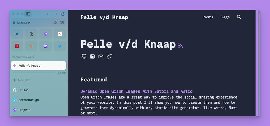
I’ve never used a browser with a sidebar before, but I really like it. You can actually read the titles of the tabs when you’ve opened way too many. Additionally, the sidebar highly rewards the use of bookmarks. I actually succeeded in organizing my bookmarks into a logical structure, which I never did before. The difference between the quick bookmarks at the top (the icon grid) and the bookmarks below works well when combining native apps like Gmail and bookmarks to normal sites. You can add folders with links to all dev environments to the normal bookmark list, and you can add often used web apps to the icon grid.
The dev bar

When I first saw the dev bar, I was blown away. It might sound stupid, but it is just such a nice touch and it makes the browser feel so much more polished. I think the team did a great job catering to developers with this amazing little feature.
Moreover, the dev bar avoids potential issues that developers would run into when using Arc without the dev bar. For example, the dev bar displays the full URL instead of the domain name, which is useful for debugging and quickly switching paths. It also features shortcuts to the important dev tools panels like Elements, Network, and of course the Console. I haven’t used the buttons of the dev bar that much, the keybinds are stuck in my head. However, for beginners that are not used to the keybinds, the buttons are surely useful.
Spaces and profiles
Arc has great support for organizing your browser into different spaces and profiles. Spaces are basically configurations of the sidebar, you can customize the color, bookmarks and the icon. This can be incredibly useful if you to organize your bookmarks differently for different projects.
Profiles are even more powerful, they basically split the browser into different instances. This means that extensions, logins, and settings are all separate for each profile. Having complete separation between profiles is immensely powerful and useful for developers. I recommend everyone to split their browser into at least two profiles, one for work and one for personal use. This minimizes the risk of accidentally leaking sensitive information or using personal accounts for work (and vica versa).
The tab opener
Arc features a tab opener similar to Spotlight, Raycast and Alfred. It allows you to quickly search for websites, extensions, and bookmarks. Since the keybindings are exactly the same as opening a new tab, it works the same way (and your muscle memory will work flawlessy). I just love this feature, it doesn’t require any extra effort to learn, but it makes the browsing experience so much better.
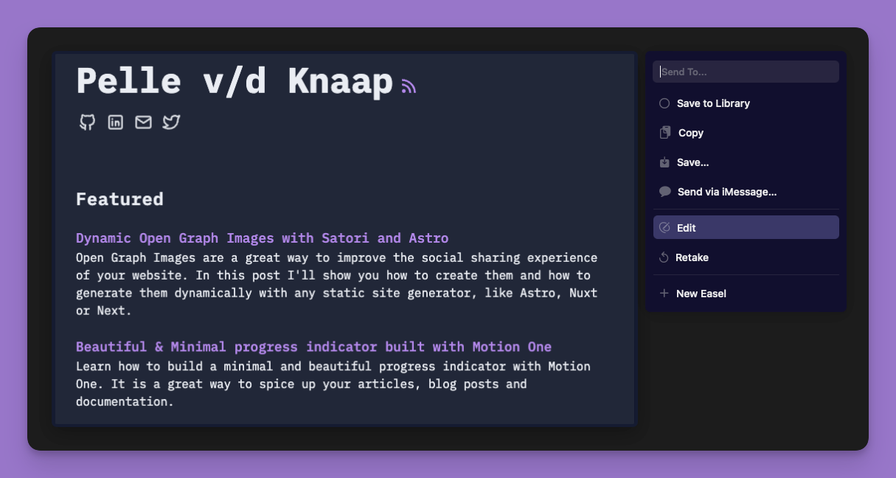
The screenshot tool

The Bad parts of Arc
Extensions can’t be pinned
For some reason, Arc doesn’t allow you to pin extensions so that they’re always visible. This is pretty annoying when you use a password manager like 1Password or LastPass. I have to open the extension every time I want to use it, which takes time and adds more process to the process.
It would be great if extensions could be pinned and always visible.
Performance is still lacking
If you come from fast browsers like Brave, Safari and Chrome, you will notice that Arc is a bit slower. Especially with 8+ tabs open, the browser starts to feel sluggish. Opening new tabs takes a while, websites need a refresh to load, and scrolling is a bit laggy. I’m sure that the team will improve the performance over time, but it’s still something to keep in mind.
My laptop is a 2018 MacBook Pro. I don’t think any newer Apple Silicon Macs will have the same issues.
Some nice-to-haves
Built-in proxies for development
Tools like Ngrok make our lives as developers easier. It would be great if Arc added shortcuts to external tools like Ngrok, so that you can quickly start a tunnel to your local environment. Integrations with the likes of Browserstack would be useful as well.
These integrations could provide a monetization model for Arc, since they would basically function as sponsored links. I’m against filling a browser with paid links, but if it is useful and it doesn’t affect the user experience, I’m all for it.
TLDR; Arc is amazing but it’s not perfect yet
The experience that Arc provides is great, but a few issues are holding it back from being perfect. The performance issues and the lack of pinned extensions are the biggest issues for me. I’m sure that the team will fix these issues over time, but I wanted to share my thoughts on Arc.
Please let me know what you think of Arc on Twitter! I’m @pelleknaap on Twitter.